Adaptive Runge-Kutta Method#
강좌: 수치해석
Adaptive Runge Kutta Method#
2개의 정확도를 갖는 Runge Kutta 기법을 비교해서 상대 오차를 계산함
\(\tilde{y}_{n+1}\) 는 더 정확한 기법
\(y_{n}\) 의 오차 : \(Error \approx | y_{n+1} - \tilde{y}_{n+1} |\)
시간 간격 \(h\) 조절
\(y_{n}\) LTE는 \(Error = O(h^{p+1})\) 이다.
\(y_{n}\) LTE를 \(\epsilon\) 까지 줄이려면 \(h_{opt} = h (\frac{\epsilon}{Error})^{1/(p+1)}\)
\(\epsilon = O(h_{opt}^{p+1})\) 이다.
Explicit Euler and Heun’s method#
Explicit Euler 기법의 시간 간격을 조절하기 위해서 고차 기법으로 2차 Runge-Kutta 기법중 하나인 Heun’s 기법을 사용하자.
Heun’s 기법을 구하는 과정에서 Explicit Euler 기법이 첫번째 Stage에서 바로 계산이 된다.
Extended butcher tableau
\[\begin{split} \begin{array}{c|cc} 0 & 0 & \\ 1 & 1 & 0 \\ \hline & 1/2 & 1/2 \\ & 1 & 0 \end{array} \end{split}\]시간간격은 다음과 같이 조절한다.
\(\tilde{y}_{n+1}\): Huen’s 기법
\(y_{n+1}\): Euler Explicit 기법
\(LTE \approx | y_{n+1} - \tilde{y}_{n+1} | = O(h^2)\)
목표 LTE: \(\epsilon = atol + rtol \times |y|\)
최적 시간 간격: \(h_{opt} = s_{fac} h (\frac{\epsilon}{Error})^{1/2}\)
\(s_{fac} = 0.9\)
Embeded Runge Kutta Method#
기존 Stage에 일부 Stage를 추가해서 정확도가 다른 Runge Kutta Approximation을 동시에 계산함
Runge-Kutta-Fehlberg method, DOPRI method 등이 존재함
여러 기법들이 존재함
%matplotlib inline
from matplotlib import pyplot as plt

import numpy as np

plt.style.use('ggplot')
plt.rcParams['figure.dpi'] = 150
# 주요 상수
m, c, g = 68.1, 12.5, 9.81

# 우변 함수 작성
def f(t, v):
    return g - c/m*v
# 엄밀해 계산 함수
def exact(t):
    return g*m/c*(1-np.exp(-(c/m)*t))
# 시간간격
h = 2.0

# 최종 시간
te = 30

# Tolerance
atol, rtol = 1e-3, 1e-3
sfac = 0.9

# 초기조건
v0 = 0

# 계신 시간 간격
t = []
y = []

t.append(0)
y.append(v0)
ti, yi = 0, v0

while ti < te:
    # Explicit Euler
    yn = yi + h*f(ti, yi)

    # Heun's method
    yp = yi + 0.5*h*(f(ti, yi) + f(ti, yn))

    # error
    err = yn - yp

    # tolerance
    tol = atol + rtol*np.maximum(abs(yn), abs(yi))
    en = np.linalg.norm(err/tol)

    if en < 1.0:
        yi = yn
        ti += h
        y.append(yi)
        t.append(ti)

    ratio = sfac*en**(-0.5)
    h *= ratio

t = np.array(t)
y = np.array(y)
# Plot Exact solution and Numerical solution
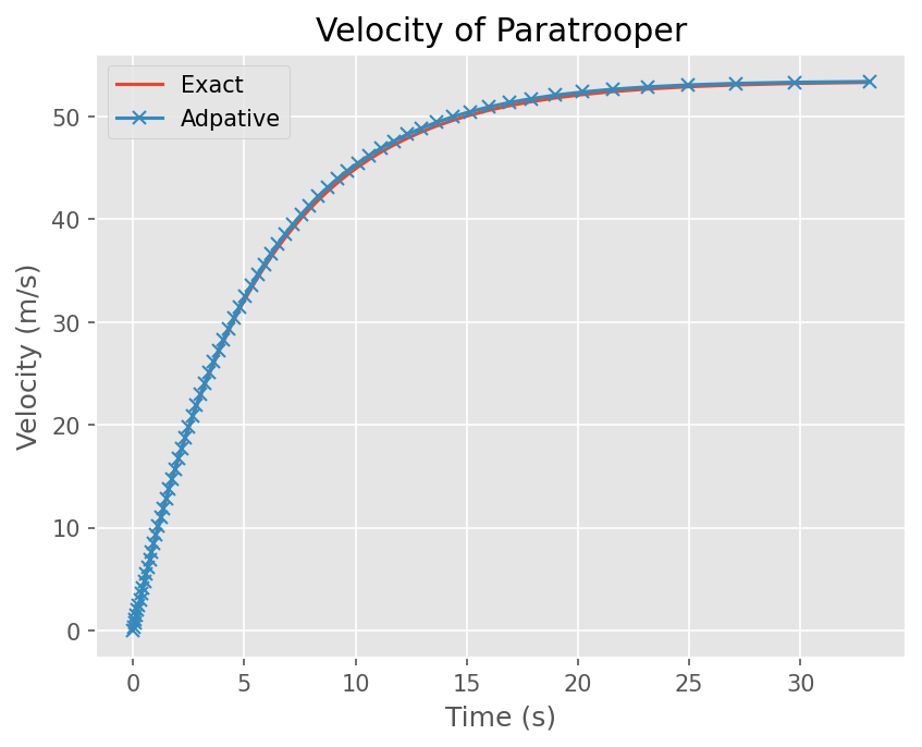
plt.plot(t, exact(t))
plt.plot(t, y, marker='x',)
# 그래프 선 이름
plt.legend(['Exact', 'Adpative'])
# x,y 축 이름
plt.xlabel('Time (s)')
plt.ylabel('Velocity (m/s)')
# 그래프 이름
plt.title('Velocity of Paratrooper')
Text(0.5, 1.0, 'Velocity of Paratrooper')